Help needed designing new BCA logo

Jenny P

Active member
The outline white cave shape on a black background with black figure inside is great - really simple and stands out.  You don't actually need to have the words "British Caving Association" in full in the logo (think BMC's logo) 'cos the cave shape says it all.

Yrammy's point about problems of replacing existing logos in forms, publications, etc. is important, so keeping a similar shape overall would make this easier.

If you made the figure inside larger in relation to the passage (to avoid problems when downsizing), and moved the letters BCA (in white lettering), to be below the cave, you would have a similar shape to the existing one, i.e. Portrait, as opposed to Landscape, and on a black background.  This would then be easy to use to insert in existing forms, letterheads, etc. to replace the old one without too much trouble.


Cookie

New member
I'd like to see some options that are an evolution of the current design.

The most important thing about a logo is that it is instantly and widely recognised.

The current logo is lively and distinctive. It has been in use since 2005. That is over a decade of building awareness and recognition.

It would great if that recognition could be retained by keeping some of the essence of the current design.

I'd have a go myself but don't have the artistic talent.


Cookie

New member
A competition was held, similar to this one.

Although it wasn't the winning entry, the design by David Gibson was selected by BCA Council.


langcliffe

Well-known member
I like the current logo. It is distinctive, novel, and the image represents caving well. Another of its characteristics is that it is more portrait than landscape. This has made it easier to incorporate into the various websites (e.g. as the icon that appears on the browser tabs).
 

2xw

Active member
The BCA logo was good for it's time but it is no longer that time and it is no longer good.
 

nearlywhite

Active member
I'm amazed there's people who think it doesn't looks like it was drawn by a 7 year old in paint. No offence meant but I personally am embarrassed to publish anything with the current BCA logo on it so I'm not sure the decade of brand recognition is all that good :-[

I really like the starter design, I'd happily have it on a document or on a stand. It's iconic of British caving.
 

langcliffe

Well-known member
nearlywhite said:
I'm amazed there's people who think it doesn't looks like it was drawn by a 7 year old in paint. No offence meant but I personally am embarrassed to publish anything with the current BCA logo on it so I'm not sure the decade of brand recognition is all that good :-[

I really like the starter design, I'd happily have it on a document or on a stand. It's iconic of British caving.

I confess that I was thinking of the BCRA design rather than the BCA - mea culpa.  I admit to having reservations about the current BCA design, although for reasons stated, I would still prefer a portrait logo to a landscape.
 

Roger W

Well-known member
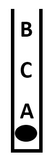
I must admit that the oval feature at the bottom of the current BCA logo - is it meant to represent a cave with stalagmites and stalactites? - makes me think of an open mouth full of decayed teeth.
 

Pegasus

Administrator
Staff member
Roger W said:
I must admit that the oval feature at the bottom of the current BCA logo - is it meant to represent a cave with stalagmites and stalactites? - makes me think of an open mouth full of decayed teeth.

Me too  :blink:
 
The BCA don't even have their logo on their front page and clearly needs a change for many reasons

But, first decide...is it still the BCA?
 

Cookie

New member
nearlywhite said:
I'm amazed there's people who think it doesn't looks like it was drawn by a 7 year old in paint.

But the concept is good. Why not just redraw it better?
 

Tommy

Active member
Cookie said:
nearlywhite said:
I'm amazed there's people who think it doesn't looks like it was drawn by a 7 year old in paint.

But the concept is good. Why not just redraw it better?

What is good about it?

Do you have any examples of large, successful, modern companies/charities/organisations with similarly styled logos?  :confused:

https://justcreative.com/2009/07/27/what-makes-a-good-logo/ (Knowledge of good logo design did exist a decade ago.)

There are guidelines for effective design, the above website runs through a few examples.
These are to be part of a wider design philosophy curated by the artists style, techniques etc, not hard and fast rules, however:

The old logo meets none of them in my opinion.

Simple - No it's cluttered and awkwardly spaced.
Memorable - I only ever remember the green stick man, and I know its says "BCA" but can't visually recall how. I never recall the shape of the adjunct cave feature.
Timeless - Already people are saying it is dated. Even very slick corporate logos get subtle tweaks every decade or so. The old logo does not have that slick foundation.
Versatile - Printed in monochrome (not black and white) I think it looks messy.
Appropriate - Personally I think caving is a pretty cool exploratory sport with many related sub-hobbies, creative interests, and academic endeavors. The old logo does not portray this image, for me it conjures up the awkward perception that exudes from niche hobby worlds such as Detectorism, Stamp Collecting, Model Trains, Wikipedia Moderation, Trainspotting (have I offended enough people yet?).

I'm not saying there's anything wrong with those hobbies, but they really don't have the same pizzazz and public appeal as Rock Climbing, Snowsports, Skydiving, Photography, Motorsports, Cycle Sports.

I know which category I know caving fits into for me...but maybe that's youthful adrenaline and adventure seeking.
 
The current logo is a nice concept, but doesn't look good. And to make it look good might require a level of detail that then makes it less distinctive.

The proposed design by Queens appeals, not least because it looks good and it's pretty simple. The main feature is the passage outline, which is still distinctive when small


Overcoming the issue of landscape/portrait for documents shouldn't be an issue, such as in the deliberately crude rehash below.


[attachment deleted by admin]
 

nearlywhite

Active member
langcliffe said:
nearlywhite said:
I'm amazed there's people who think it doesn't looks like it was drawn by a 7 year old in paint. No offence meant but I personally am embarrassed to publish anything with the current BCA logo on it so I'm not sure the decade of brand recognition is all that good :-[

I really like the starter design, I'd happily have it on a document or on a stand. It's iconic of British caving.

I confess that I was thinking of the BCRA design rather than the BCA - mea culpa.  I admit to having reservations about the current BCA design, although for reasons stated, I would still prefer a portrait logo to a landscape.

That's fair enough - I'd be happy if we could get away with just stealing it from the BCRA  :LOL:
 
46044004552_da5a82a1bd.jpg


Something like this....?
A full text title is optional.....

or
46094551861_af3e62b25f_b.jpg


Cookie

New member
I disagree Topimo. I think the current design does tick the box for all five criteria (Simple, Memorable, Timeless, Versatile and Appropriate).

The bit that works is the stick man. I'm less keen on the stal. oval. Originally I thought that would give another element to play with but don't think that has ever been done. I once tried it as a favicon but the stick man works better.

I like the proposed design as well but I do think it falls down on the Memorable test. To the public at large it's just a white blob. The design should work for the public as well as cavers. I bet you even most cavers wouldn't recognise it until you pointed it out as Alum Pot.

The best view in British caving isn't looking out into Alum Pot, the best view in British caving is looking out into Alum Pot with an abseiling caver. Here's my genius idea. Remove the standing caver and add the abseiling stick man, in silhouette. That'll give some continuity from the old to the new.


Top