• WIN 1 of 2 copies of OGOF FFYNNON DDU in our latest caption competition!

    Featuring 176 pages of lavish photography, a history of this classic Welsh system's exploration and first hand accounts of that dramatic rescue - from both sides of the stretcher!

    Click here to enter

Help needed designing new BCA logo

Cookie said:
The best view in British caving isn't looking out into Alum Pot, the best view in British caving is looking out into Alum Pot with an abseiling caver. Here's my genius idea. Remove the standing caver and add the abseiling stick man, in silhouette. That'll give some continuity from the old to the new.

might be worth a look.. would rather it be an actual silhouette rather than the stickman though I would think..
 
Roger W said:
I must admit that the oval feature at the bottom of the current BCA logo - is it meant to represent a cave with stalagmites and stalactites? - makes me think of an open mouth full of decayed teeth.

It's clearly a mitochondrion... Which would explain why there's no ladder due to the Electron Transport Chain pumping away. I guess it explains why Gibbs free energy is used for ascending...
I'm not sure I've told a more niche set of jokes  :-\ If it catches on it'll only be a FADH2

Really tried to work in Mitochondrial encephalopathy, but it was beyond M.E.
 
Cookie said:
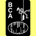
I like the proposed design as well but I do think it falls down on the Memorable test. To the public at large it's just a white blob. The design should work for the public as well as cavers. I bet you even most cavers wouldn't recognise it until you pointed it out as Alum Pot.

I like that it _isn't_ instantly recognizable as a particular cave, yet you can look at it and see that it is a cave (the hint for the general public being the guy standing in it, which gives it scale, and British Caving Association written below it).

I think it would be very easy to get into debates about minutiae of the logo's graphical content while missing the bigger picture:

**the image is decoration for the text**

(nothing more). What makes the logo good is a good choice of font, with the large 'BCA' letters correctly spaced up against the letter-sized image (yes it's larger, but it's in proportion) and with 'British Caving Association' below it. If the image doesn't decorate the text well, it isn't good.
 
Sam Richards said:
...

The proposed design by Queens appeals, not least because it looks good and it's pretty simple. The main feature is the passage outline, which is still distinctive when small


....

I showed it (edit: the Sam Richards iteration) to a non-caver. He wanted to know why an expectant mother was silhouetted on an outline map of France. He had no idea it was meant to be a caver  / cave and was baffled by the BCA abbreviation.
 
martinr said:
I showed it (edit: the Sam Richards iteration) to a non-caver. He wanted to know why an expectant mother was silhouetted on an outline map of France. He had no idea it was meant to be a caver  / cave and was baffled by the BCA abbreviation.

Market research gives unexpected insights. Made me laugh.
 
Any further thoughts folks?

I've had a number of cavers tell me personally that they like this one:

wl


Topimo, your post was really helpful, thank you - did you look at some of the examples of bad logos?  They can't be real surely??  :lol:

https://justcreative.com/2009/07/27/what-makes-a-good-logo/

Thank you, Jane
 
Pegasus said:
Any further thoughts folks?

I've had a number of cavers tell me personally that they like this one:

wl


Topimo, your post was really helpful, thank you - did you look at some of the examples of bad logos?  They can't be real surely??  :lol:

https://justcreative.com/2009/07/27/what-makes-a-good-logo/

Thank you, Jane

I too like this one but I guess it will need to be tried in a number of different media and sizes.

The current logo, I really don't like. Every time I look at it I see a pirate running up a wall using a handline or a sort of dancing figure from one of those kids shows where they teach them their alphabet.
Or is it just me?  :-\
 

Attachments

  • BCA-3shades-w4325-600x600.png
    BCA-3shades-w4325-600x600.png
    42 KB · Views: 384
A landscape logo would be a problem for me with some forms I use. Replacing a portrait one with one the same dimensions would be less work - although will still take me some time.
Mary
 
yrammy said:
A landscape logo would be a problem for me with some forms I use. Replacing a portrait one with one the same dimensions would be less work - although will still take me some time.
Mary

I agree. I have the same problem. However, Sam Richards presents an alternative portrait version a few posts back which should work under such circumstances.
 
yrammy said:
A landscape logo would be a problem for me with some forms I use. Replacing a portrait one with one the same dimensions would be less work - although will still take me some time.
Mary

Hi Mary, a portrait version of the logo is being taken into account.  I realise some work will be involved for a number of people if/when the logo changes, however this should not be a reason to stay with the current version. 

I've been in touch with the guy who designed the potential new logo and he's working on some tweaks, taking comments here into account :)
 
I am not saying stay with the old one.  I just need to make sure that as a paid employee it is understood that it will take me a while to update forms etc :-)

Mary
 
Would be neat if the colours could be inverted? (or at least an options to have a white background version), caver to look more like he/she's carrying a tackle bag and the cave more cave like (to me looks like a wolf howling!), or a circle? Just a little play around...


[attachment deleted by admin]
 
Back
Top