You are using an out of date browser. It may not display this or other websites correctly.
You should upgrade or use an alternative browser.
You should upgrade or use an alternative browser.
Help needed designing new BCA logo
- Thread starter Pegasus
- Start date
SqueezyPete
Member
I like the Queens one too, but I'll post this because I've been iterating on a design I never got round to finishing for CHECC


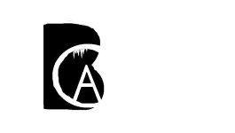
Designing a good logo is really quite difficult. The logo at the beginning of this thread looks nice large but I think the person would be lost when it is shown small. Also I think it only really works with a black background and so it won't look good as a letterhead even with the black and white reversed.
The entry by Aberystwyth Caving Club with the implied "B" I thought was innovative and looked really good but suffers from the same problem re background colour. Also, the colour of the "C" and overlapping letters doesn't lend itself to working in black and white. However it does make use of the helmet and lamp logo which instantly says caving! This probably won't date too badly (?) which is something else to think about in logo design.
If I was designing the logo I would start with Aber's helmet idea, possibly putting the "BCA" text on the helmet. You could imply the three dimensional aspect of the helmet by curving the letters (done pretty badly in my attached drawing but you get the idea).
Alex
https://drive.google.com/open?id=0B2kXtSDc0912b1A0aENydklVQ3Fpa3JOb1ZCT3IwSVdNU25F
From comments made at BCA meetings some people think it is very dated, mostly the younger members. I've heard it compared to something from 1970s children TV imagery. BCA are looking to produce new information material and if there ever was a good time for a new logo it would be before this is designed and printed. I think it sends a good message to, that things are moving forward.
JoshW
Well-known member
Pegasus said:The BCA logo needs updating.
If you have artistic flair, design capabilities and are willing to help, PM me or post your logo ideas on this thread.
Your help would be much appreciated, thank you
Here's a starter for 10....

I really like this one. I think it's key with logos to keep it simple (see nike, adidas, even the BMC). the inverted version of this still looks really smart and identifiable so letter heads etc wouldn't be a problem.
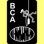
I think it's about time for a new logo, the existing one is clearly dated (plus is on a black background as well). It's not a professional looking logo, it's overcomplicated and it's not particularly identifiable, your eyes are darting all over the place from the words to the abseiler to the cave.
alastairgott
Well-known member
Badlad said:I've heard it compared to something from 1970s children TV imagery.
I think there's still a fight left in Children's TV imagery from the 70's...

andrewmcleod
Well-known member
The more I look at that logo, the more I like it...
The individual elements fit together in terms of their spacing and sizes, with the smoothness of the font offset by the jagged, irregular edges of the opening. The image itself is great - it's something human scale but alluring; we can tell something is ahead but we don't know what. It belies the usual myth of tiny cave passages, while not trying to show something very large in something very small (which would fail, I think). Whoever and wherever the mysterious figure is (for the general public who won't know), the bag suggests adventure!
I still think it might be a bit complicated; would be worth seeing what it looks like at lower resolution and, where appropriate, in versions without the 'British Caving Association' bit and possibly with a simplified version of the cave passage.
aricooperdavis
Moderator
When I tried to see what the current logo is by going to british-caving.org.uk I was greeted by the broken image placeholder, and when I go to the image URL itself I'm told it's "forbidden".
yrammy
Active member
From an administration point of view I don't mind the actual content of a new logo but want to make sure implementation issues are considered as part of its design. For instance, I use a set of forms for training which have the current logo. Changing this for a new on with the same dimensions would not be too difficult, but if the overall dimensions change this may well though out the formatting of my form. Again, this can be overcome but it would take a lot more time. I have 50 individual copies of this form - one per trainer assessor - bearing the individuals signature. This is just one example of forms I use.
So implementation for me would take time.
Thanks
Mary
So implementation for me would take time.
Thanks
Mary
Cave_Troll
Active member
I worry that the "[white cave] BCA" logo might not scale well to letterhead size.
might the person in the cave would become too small?
might the person in the cave would become too small?
Cookie
New member
aricooperdavis said:When I tried to see what the current logo is by going to british-caving.org.uk I was greeted by the broken image placeholder, and when I go to the image URL itself I'm told it's "forbidden".
Hi Ari,
Thanks for mentioning. It should be working now.
Try it again at http://british-caving.org.uk/wiki3/lib/exe/fetch.php?media=logo.png
As you spotted, it was a permission issue.
Tommy
Active member
aricooperdavis said:When I tried to see what the current logo is by going to british-caving.org.uk I was greeted by the broken image placeholder, and when I go to the image URL itself I'm told it's "forbidden".
Zoom!
Attachments
Cookie
New member
Cave_Troll said:I worry that the "[white cave] BCA" logo might not scale well to letterhead size.
might the person in the cave would become too small?
What's nice about the current logo is that the stick man scales quite nicely to a small square icon that is still distinctive. See him in your browser's tab on the BCA website.
PeteHall
Moderator
Cave_Troll said:I worry that the "[white cave] BCA" logo might not scale well to letterhead size.
might the person in the cave would become too small?
Try printing it and see...
Looks fine (well excellent actually) on a small phone screen if that's anything to judge it by.
Similar threads
- Replies
- 3
- Views
- 653


